No More Stale Direct Mail

By Lorrie Bryan
Print technology is evolving rapidly, and, accordingly, direct mail is moving way beyond the standard #10 envelopes and “billboard” postcards.
With the latest digital-printing technology and the availability of distinct paper stocks, folding options, finishing techniques, special inks, and coatings, if you can imagine it, you can likely create it. The design techniques and materials you choose for your direct mail and marketing communications can help grab your targeted recipient’s attention and set you apart from the competition.
Here are 6 design strategies to consider for outstanding no-fail direct mail:

BLAZE A TRAIL
Resist the urge to do what everyone else is doing and what you’ve always done. Get off the well-worn path, and blaze a trail. Leverage the latest print technology to make your direct mail stand out. “According to the U.S. Postal Service, 81 percent of recipients read or at least scan their mail daily, taking up to three seconds per piece. For this reason, it’s important to stand out,” says Terri Price-Deep, a member of the business development team at Millcraft. “Eye-catching design or textures can make the recipient pause and engage.”
DON’T SPEND MONEY TO NO AVAIL
Just because you can create it, doesn’t mean you should create it. “You can do more amazing things with direct mail than ever before, and the options are more affordable. But resist the urge to overdo,” advises Trish Witkowski, an expert in creative direct mail formats and engagement strategies.
“You can get a lot of impact with simple design elements without impacting your budget. Don’t lose sight of your goal. Know your tools, and use them purposefully to enhance the experience for your audience and increase engagement. Be mindful of how you want to take your audience through the content,” Witkowski explains. “Your piece should reinforce your message and not distract from it.”

VARY COLOR AND SCALE
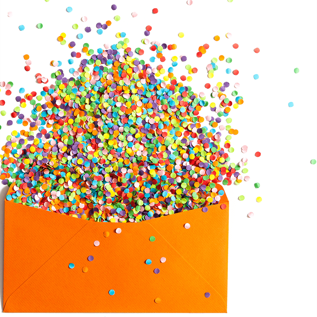
One of the simplest and most basic ways to attract attention to your direct mail is to go bolder and bigger (or smaller). Consider adding color to your envelope instead of sending out mail pieces in white envelopes with a simple logo or return address. Add imagery, a call-to-action, or bold color to the envelope so it stands out from the usual black-and-white pile that the recipient is holding in his or her hand. Instead of a standard-size mailer, deliberately go larger or smaller.
ADD TACTILE DETAIL
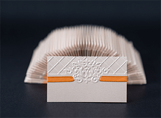
The more senses that you can touch, the greater the engagement with your audience will be. You can create effective sensory experiences by using nonstandard texture for your communications. “Special press coatings and print effects can be a great way to get attention, and there’s a lot of neuroscience research to back it up. In short, humans respond to touch, and touch provokes emotional response,” says Witkowski, an educator, author, and award-winning designer. She suggests that you make your marketing collateral irresistible.
“Add a soft-touch UV press coating for a rose petal feel. Use a sandpaper UV coating to add distinct texture and grit. Digital printing effects like raised clear ink and white ink on colored papers are distinct and beautiful. Super smooth or textured envelopes can stand out, too,” adds Witkowski.

STRATEGICALLY UNVEIL
Good storytellers, both in books and movies, know how to engage their audience by masterfully managing the plot elements that they conceal and reveal. Likewise, you can use various design elements to manage your audiences’ experience with your message and to increase engagement. Creative opening mechanisms (zip-strips, pull-tabs, string-pulls), peek-a-boo windows, and unusual folding formats can enhance the way your message is revealed and conveyed.
“Zip strips are wonderful little mechanisms that work like paper zippers. They’re fun to pull, and they offer a more interesting way to get into an envelope or a folded self-mailer. I like to combine the zip-strip with a message to get extra impact,” Witkowski says. “For example, when the mailer is closed, maybe the zip-strip has a message printed on it, like ‘What are you doing on June 24?’ And then when the recipient pulls the tab to open the piece, the answer is revealed: ‘Come to our open house.’”
Witkowski, who has spent more than 20 years collecting, analyzing, and documenting creative direct marketing solutions, notes that giving people something to do is a solid strategy for mail. “Peek-a-boo windows offer an easy way to make prospects curious about your mailing, and they are super easy to create,” she says.
Mechanisms can be used to create fun and simple visual tricks that further engage the recipient. “A visual trick is when imagery is the focal point,” says Witkowski, “and the audience is somehow invited to interact with it—maybe by revealing a slightly different image behind the original one—think smiley face to sad face—or by using a short fold to remove a phone from the cradle or to ‘open’ an oven door.”
GET THE HAMMER ON THE NAIL
You can devote your entire budget to producing attention-grabbing mail pieces that may be ignored and trashed if you aren’t sending the right message to the right people at the right time. Make sure that your mail list and your offer are spot-on. “It doesn’t matter how well designed, creative, and beautiful your piece is if it doesn’t get in the right hands,” Witkowski says. “And make sure your format enhances your content rather than distracting from it.”
There are no rules in designing look-at-me direct mail, but always remember that the fun is in the surprise. “The experience for the targeted recipient of receiving and opening the mail piece becomes memorable and intriguing and can lead to a response or further investigation,” says Witkowski.
What could have been stale is now suddenly fresh. What could have been lost in the mailbox is now getting all the attention.
Enjoy this article? Share it!
Enjoy this article? Share it!
